2015.10.13
Design, Concept and Graphics
Thanks to Lynn Valde (Pelletier)
and son Kieran Valde, both alumni.
 The Early Years (1967-1983)
This was the cover of the 1967-1968 yearbook. The logo contained four elements: the globe in the background, the Manitoba Bison, the lamp of learning and the logo for Canada’s Centennial which was in 1967, the year LRC opened. It is last seen on a yearbook in 1982.
As to why or how these were chosen, your guess is as good as ours. It could be said that we are learners in an ever-expanding community. (provincial, national, international)
Logo of Canada’s 1967 Centennial celebrations, designed by Stuart Ash.
The Lamp of Learning – The symbol of an oil-burning lamp is a classic symbol of knowledge and wisdom. Light symbolizes knowledge as darkness symbolizes ignorance. Knowledge removes ignorance just as light removes darkness.
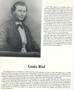
This page, taken from the 1968 yearbook, shows the importance of our namesake, Louis Riel, the founder of our province, Manitoba.
The school sports teams of the early years of LRC were called the Rebels.
The Intermediate Years (1983-2011)
This stylized and updated logo of Louis Riel was used as CLR’s logo while it was associated with the St. Boniface College and as it transitioned to the DSFM in 1994. School teams became known as Les Voyageurs.
The Recent Past (2012-2015) / Le Présent
In September 2012, the CL-R adopted a new logo. The choice of a new logo was a collaborative project with the Comité scolaire of the school. With the support of a professional graphic designer, the working committee was able to identify images and submitted recommendations and modernize the school logo. In addition, this work incorporated student ideas in the redesign of the official logo. Below you will find the reason for the different elements of the logo:
• the stylized sash connects Métis culture (its connection with Louis Riel) with modernity found in contemporary abstract style of the logo;
• the colours are the same as those of the Franco-Manitoban flag and green is predominant because it is the color of the school;
• weaving represents the proximity and strength of the community; the student who emerges from the belt symbolizes that the community rallied to support and educate the student;
• the student’s arms that rise show that it is proud to be the CL-R and being a community member.


